Blank-leaving is always an indispensable part of the minimalist style design.
This is a new house with an area of 120㎡, modern minimalist style as the keynote, In the pure white space, some wooden-style elements are added for embellishment. The neat layout, plain color scheme, mild and gentle wooden products, all these different elements work together to build a warm and healing living space.
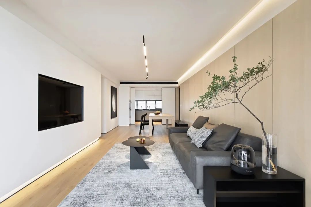
Reshape the traditional spatial pattern. Combine the living room with the dining room, and the partitioned space becomes a flowing one. The view is opened, and it is more comfortable to walk, sit and lie down. The ceiling is decorated with the flexible magnetic track lights and there isn’t any extra ornamentation on the entire TV background wall, conveying the pursuit of life aesthetics with minimalism.
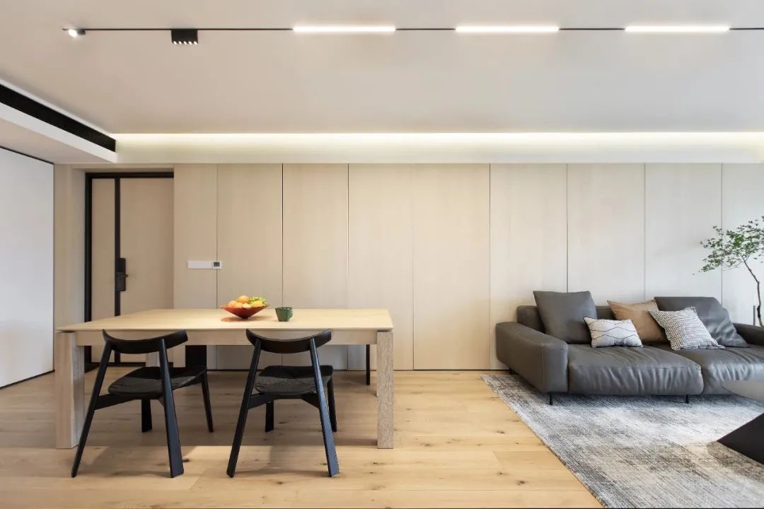
Use linear lights and downlights to create a sense of line and multi-layer of light, so that the minimalist style can be perfectly presented.
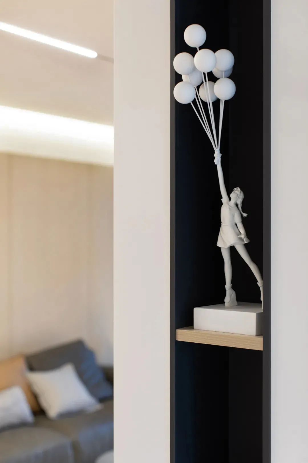
Foyer
Open the door and step into the foyer. It is an L-shaped layout, pure white as the main tone, combined with soft lighting, giving people an open and bright feeling. The bottom of the foyer cabinet is about 20 centimeters above the floor, which is used to store the daily shoes. The 1.5m long strip-shaped bench is a smart design for changing shoes. Such details design is fully humanizing.

Living room
Let’s first look at the overall layout and design of the living room. The large area of blank-leaving on the white wall virtually widens the space. The original sliding door for the balcony was removed, and the scenery outside is integrated into the living room, creating a rich visual feast through the change of light and shadow under the vague light.
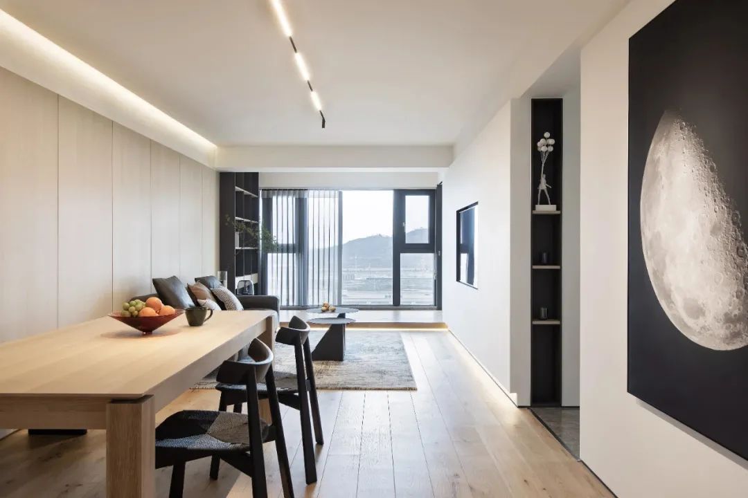
The ceiling is in a simple flat shape, and an installation area for recessed light strips is reserved on the side, combined with super long magnetic track lights and scattered downlights. The no-main-light design is simple and elegant, and it also provides all-around lighting.
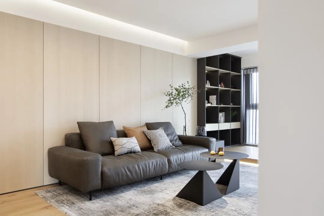
There is no extra ornamentation. Only long linear lights are mounted on the wall over the sofa for simple decoration, which can be used as localized general lighting. The soft and comfortable leather sofa awakens the joy and belongingness at home under the warm light.
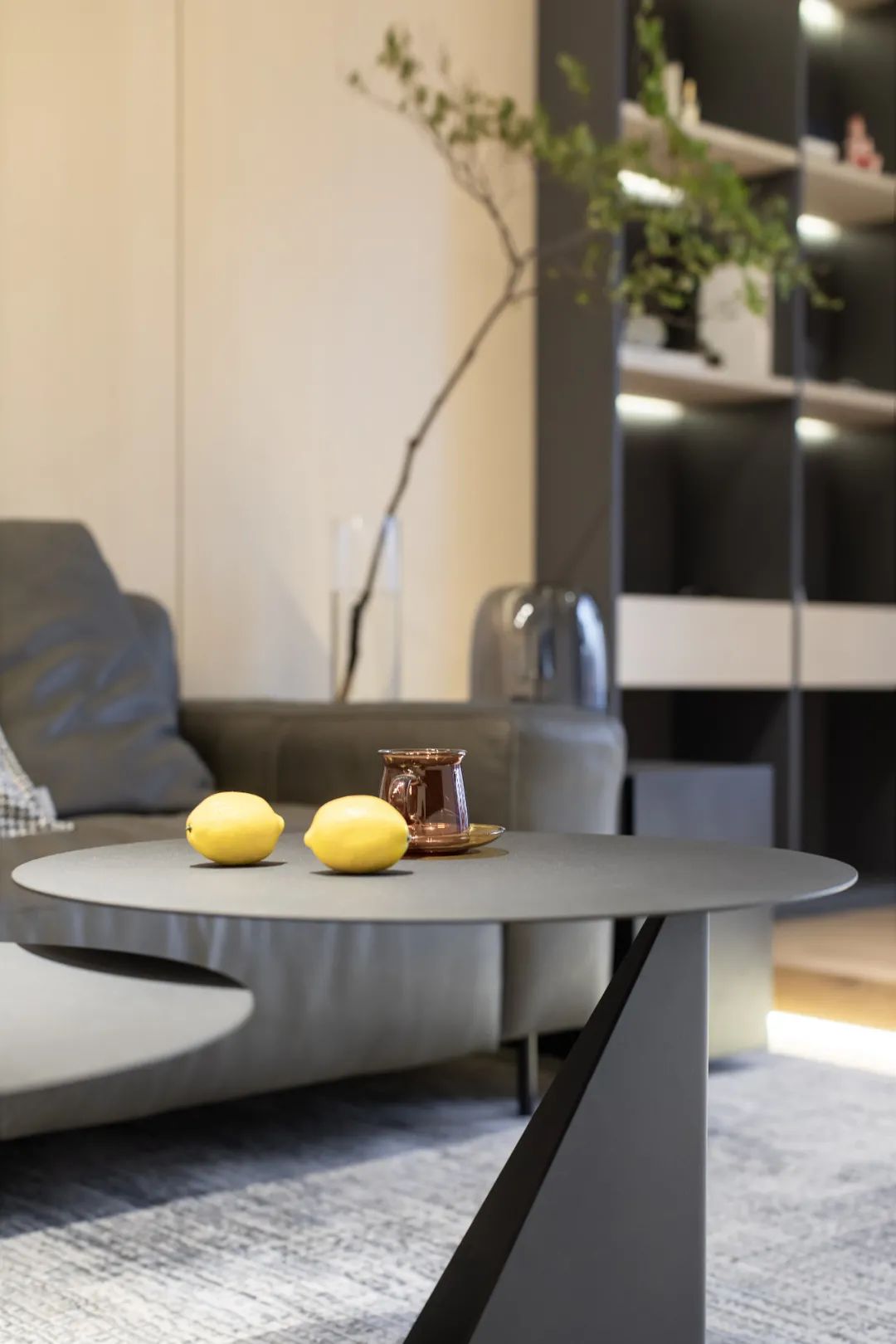
The floor-to-ceiling windows play an extremely important role in this space. The designer uses the structure of the window sill to give it wood material and steps, while taking its function as a floor platform into consideration, reserving recessed lighting, and integrates it with the TV wall and wall over the sofa.

Dining room
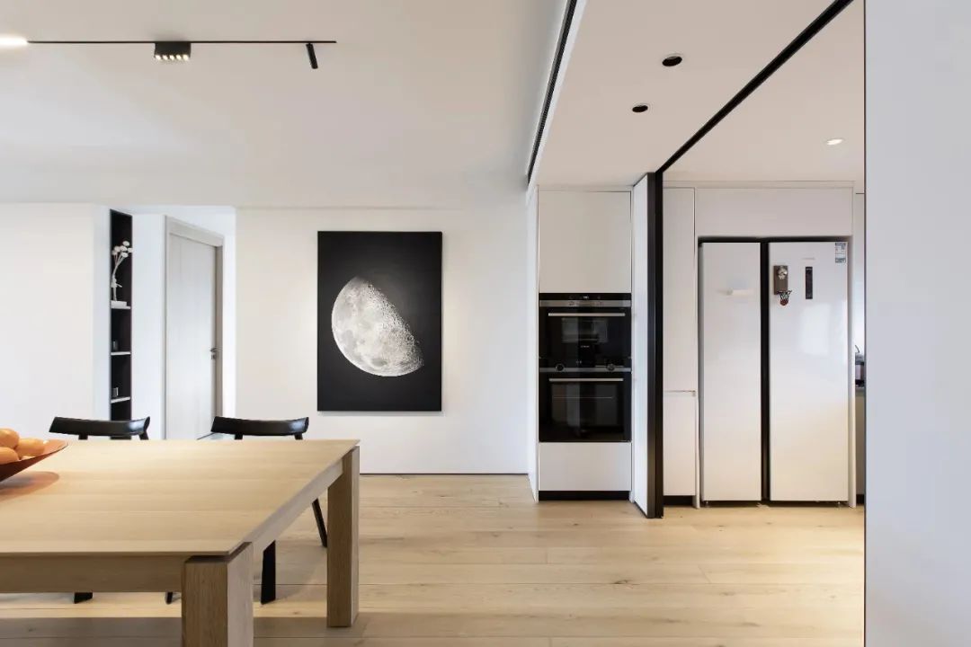
The dining room is connected to the living room, and the wooden floor throughout shows the sense of space. Different from the simplicity of the living room, the design of the dining room is focused on traffic flow and storage. The glass door divides the dining room and kitchen, blocking the unpleasant fumes.
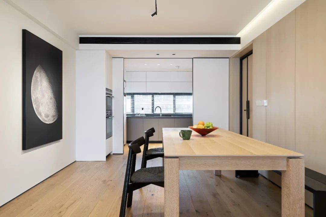
The natural transition from white to wood color, means a conversion from gentle to diligent. The slim refrigerator is at the same height as the cabinet. The kitchen sliding door can be completely hidden behind the wall panel, adding to the neatness of the space. The combination of wall cabinets and floor cabinets strengthens the storage function. And the U-shaped layout maximizes the use of the kitchen space.
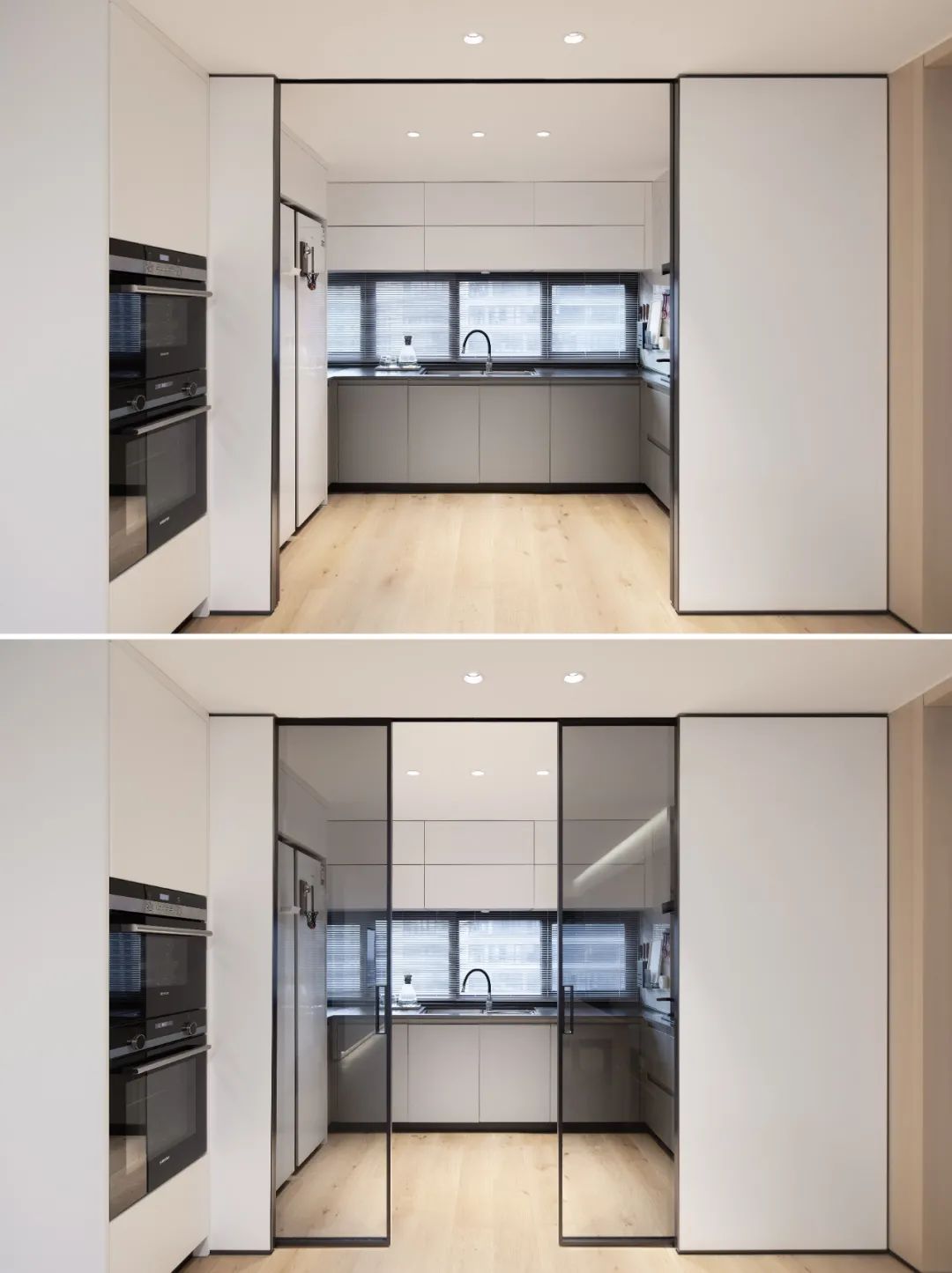
Corridor
A sliding door in the corridor enriches the structure and usage of the master bedroom and multi-functional area. When the door is closed, due to reflective mirror, the room looks much more spacious. Open the door, and it’s like entering another world.


Bedroom
The wall is divided into upper and lower sections by a wood panel. And it is decorated with light strips, displaying the beauty of simplicity of the pure white space while avoiding the crudity of the wall.

Redundant decorations are removed in the bedroom. The lighting design without main lights, indirect lighting, plus an extensive use of white and wood color makes the atmosphere of the bedroom softer. The metal frames of the white cabinet door can serve as functional handles. Also, they are ornamentation of the pure white cabinet doors. The irregular shape is taking a break from the routine.

Children’s room
The children’s room continues to adopt the lighting design without main lights. The white and wood colors create a cleaner and purer living space for the children. The hollow-back chair adds fun to the study. The built-in wardrobe is customized by exploiting the corner of the wall. It just meets the storage needs. The shape is simple and classic, and the practicability is also good.
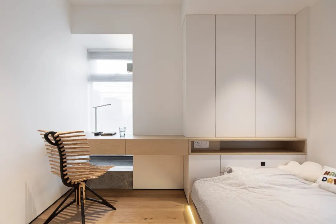

The motion sensor lights and reading lights at the bedside of the children’ room are replaced with troffers and art droplights, endowing the space a sense of line. The entire room is, so to speak, a combination of function and aesthetics, neatness and interest.

Bathroom

The simplified version of 3-way-bathroom layout is a highlight of this plan. Separate toilet and shower room bring about much comfort to the small apartment with only one bathroom. It looks compact yet natty in the lighting design without main lights.


Compared with traditional lighting, the advantage of no-main-light design is that it is natty, easy to maintain, providing more uniform and comfortable light and more flexible lighting area. The minimalist approach of extensive use of blank-leaving in the no-main-light design underplays the space, interface, tones of color and material, simplifies what is complicated and tastes the purity of real life. Creating a minimalist living space with the magic of light, we are dedicated to providing professional solutions of lighting design without main lights, making life simple and extraordinary.

